Redesigning a self-payment
At the busy student lunch restaurant “A Bloc” (run by Fazer), you are only able to buy your lunch with the self-payment system. However, the self-payment system requires constant help from staff as the interface is hard to use and, as a result, the queues for the payment are long, especially during the rush hour.
Moreover, to get the student discount, users are required to prove their student status. With the self-payment system, this is only possible by using two additional apps: MobilePay and Frank. When students do not use any of these apps, their status has to be manually approved by a staff member. In the end, the efficiency of the self-checkout failed, as the staff members have to help out constantly with validating the student status or helping out visitors to buy lunch.
In the class “Designing Interactions” taught by Severi Uusitalo we received the task to improve the system for a better user experience.
Year: 2018
Task Duration: Two weeks
Group Members: Juuso Koski, Xinyue Du, Senciria Chou
Tasks: Interviewing users, Research analysis, Prototyping, Usability testing, Visual Design


Research
Observation / Interviews / System Analysis
Analysis
Behavioural variables / Persona / Scenarios
Concept
Generating and modifying concepts
Prototyping
Paper Prototyping / Feedback Analysis / Iterating
Results
Interactive Prototype / Suggestions / Roadmap


User Research & Analysis
We applied several research methods to understand the visitor’s motivation to go to the restaurant, their background, and experience with the payment system. Besides this, we also interviewed staff members to understand their point of view better to be able to improve the whole process.
We applied the following methods for our research:
- Nine semi-structured (10-15min) interviews
- Rapid ethnography
- Context inquiry (especially staff)
- Observation during rush hour and off-peak
Analysis
Pain Points
Based on the research we identified the pain points with the self-checkout system:
- Mismatch of stages and expectations of what should happen, for example, when choosing “MobilePay” the user has to choose again between “MobilePay and “Yomani”
- Unclear phrasing, such as, “YOMANI” for card payment and issues with meal names
- Lunch prices for students visible only after connecting to the app
- Lack of necessary information (allergens etc.)
- Lack of instructions and guidance to use the interface, card reader, or how to connect to MobilePay.
- The system sometimes does not change or crashes completely
With these problems in mind, we tried to find a solution for each pain point in our designs.
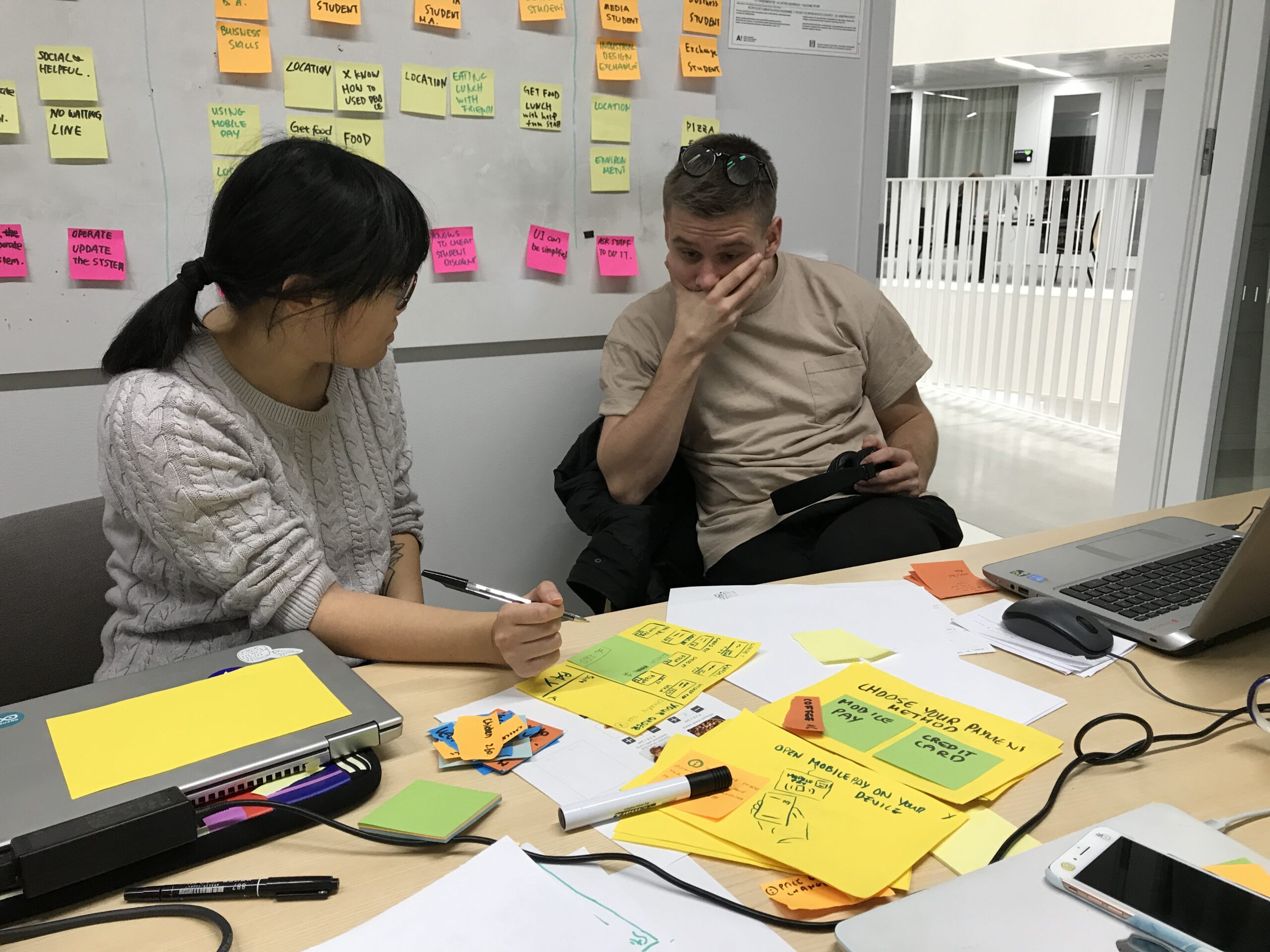
Personas
We created personas to understand the users, their goals and behaviours. To create these personas we followed the Alan Cooper method and mapped different interviewed users with their behavioural variables and identified patterns.


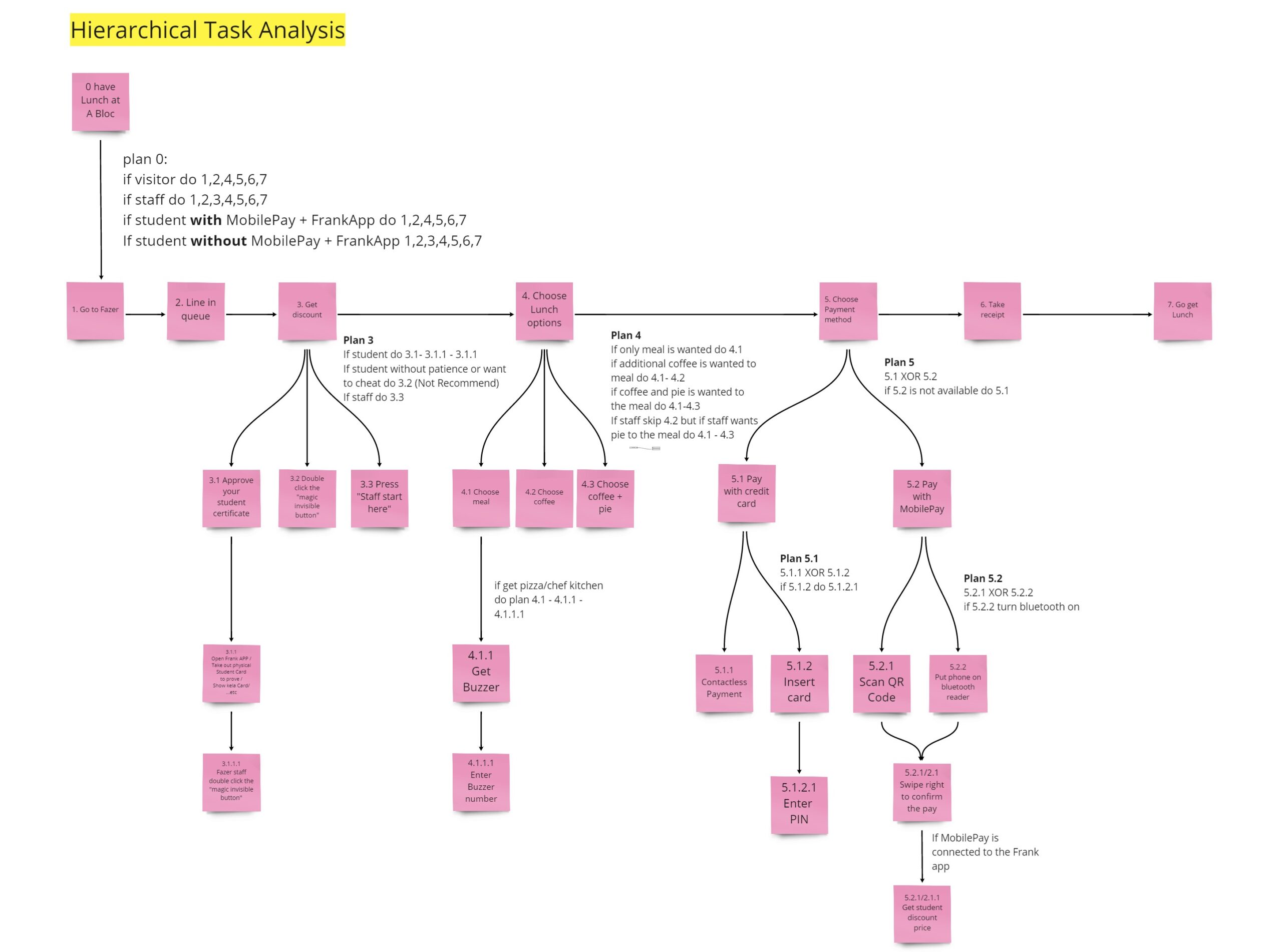
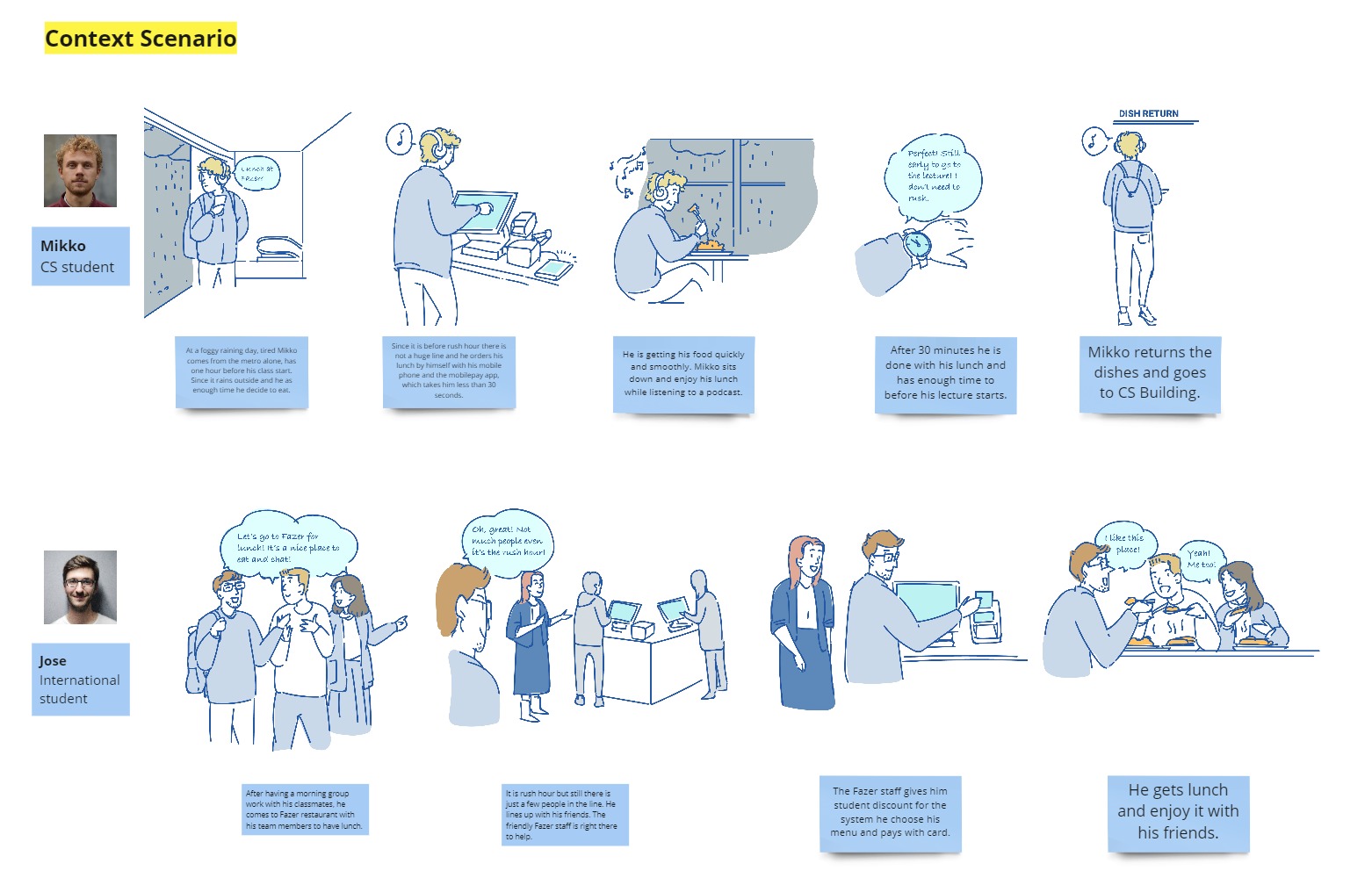
Hierarchical Task Analysis and Context Scenario
To grasp a better understanding of how the interface works and what steps are needed we analysed the user interface and system to identify the steps which could be reduced to reach the same goal. For this, we applied the hierarchical task analysis method. The analysis helped us to work on our context scenarios.

Designing
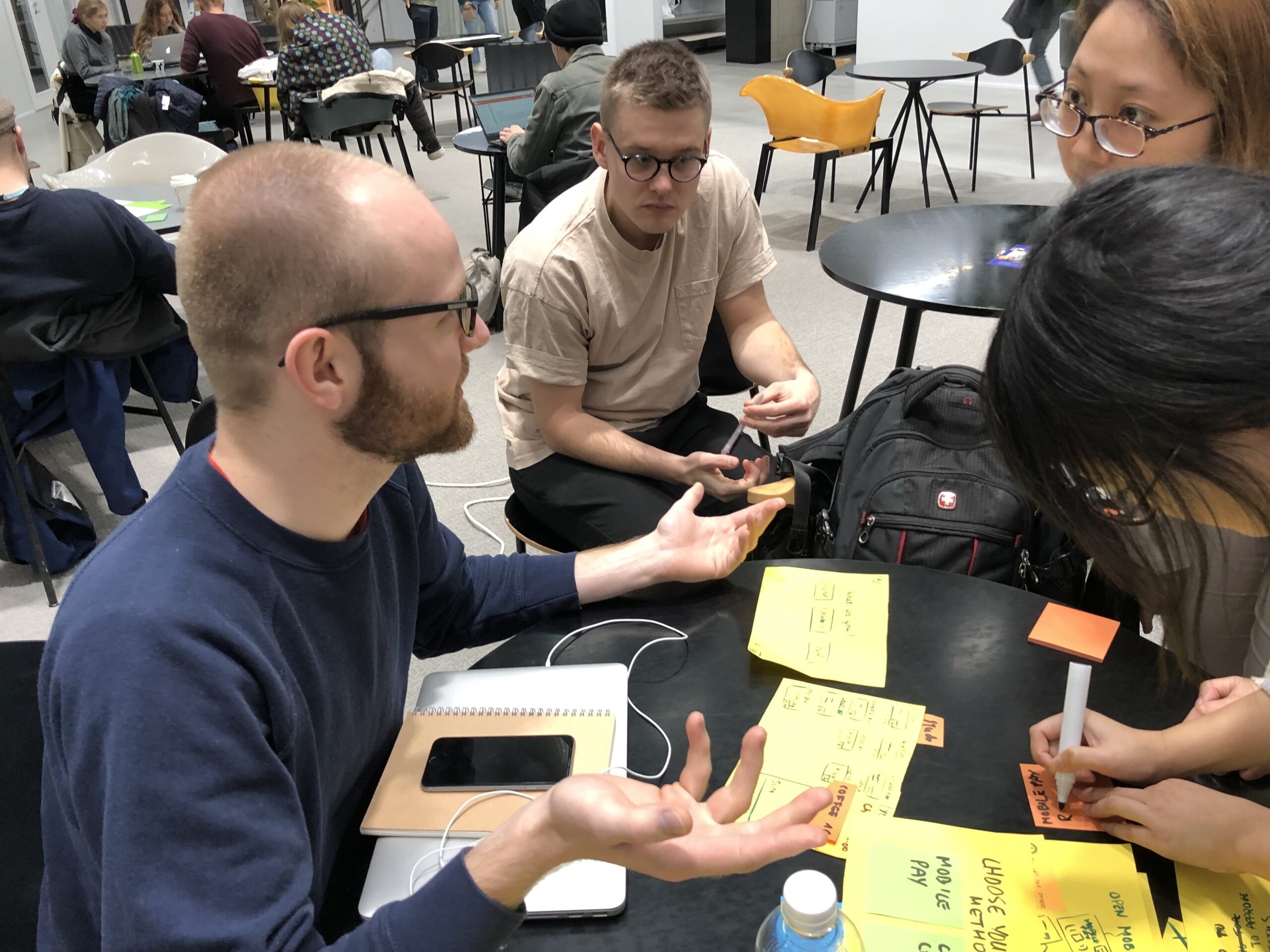
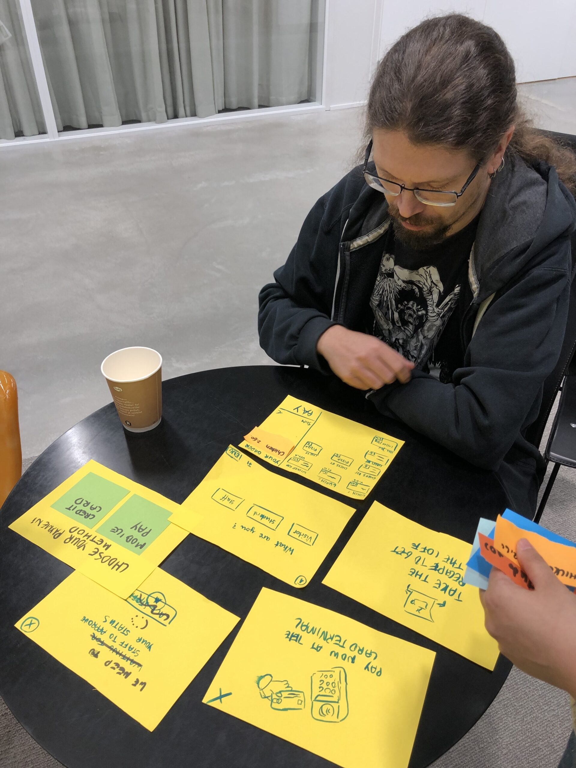
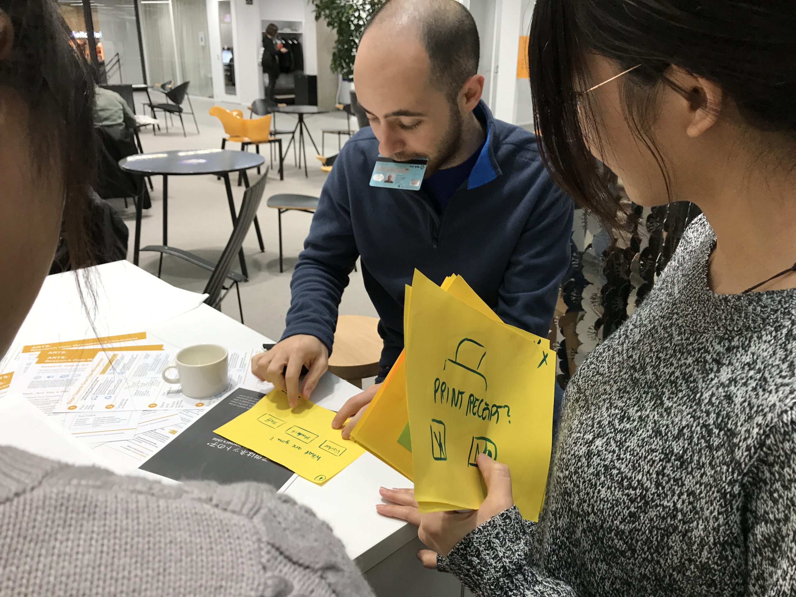
Based on the scenarios, task analysis and personas we started to conceptualize our designs. The benefit we had was that we worked as a team, so we decided that everyone should wireframe first on their own a solution and then we compared them to find the pros and cons of each design to get the best outcome.
Paper prototype & usability testing
We decided to continue with two designs concepts as both of them had different advantages and disadvantages. We created simple paper prototypes to test the designs quickly with users. For this, we gave the user the task to pretend that the paper prototype is a real interface to buy lunch and they should interact with it and think out loud. Based on the test we could quickly make changes and collect feedback and other suggestions.
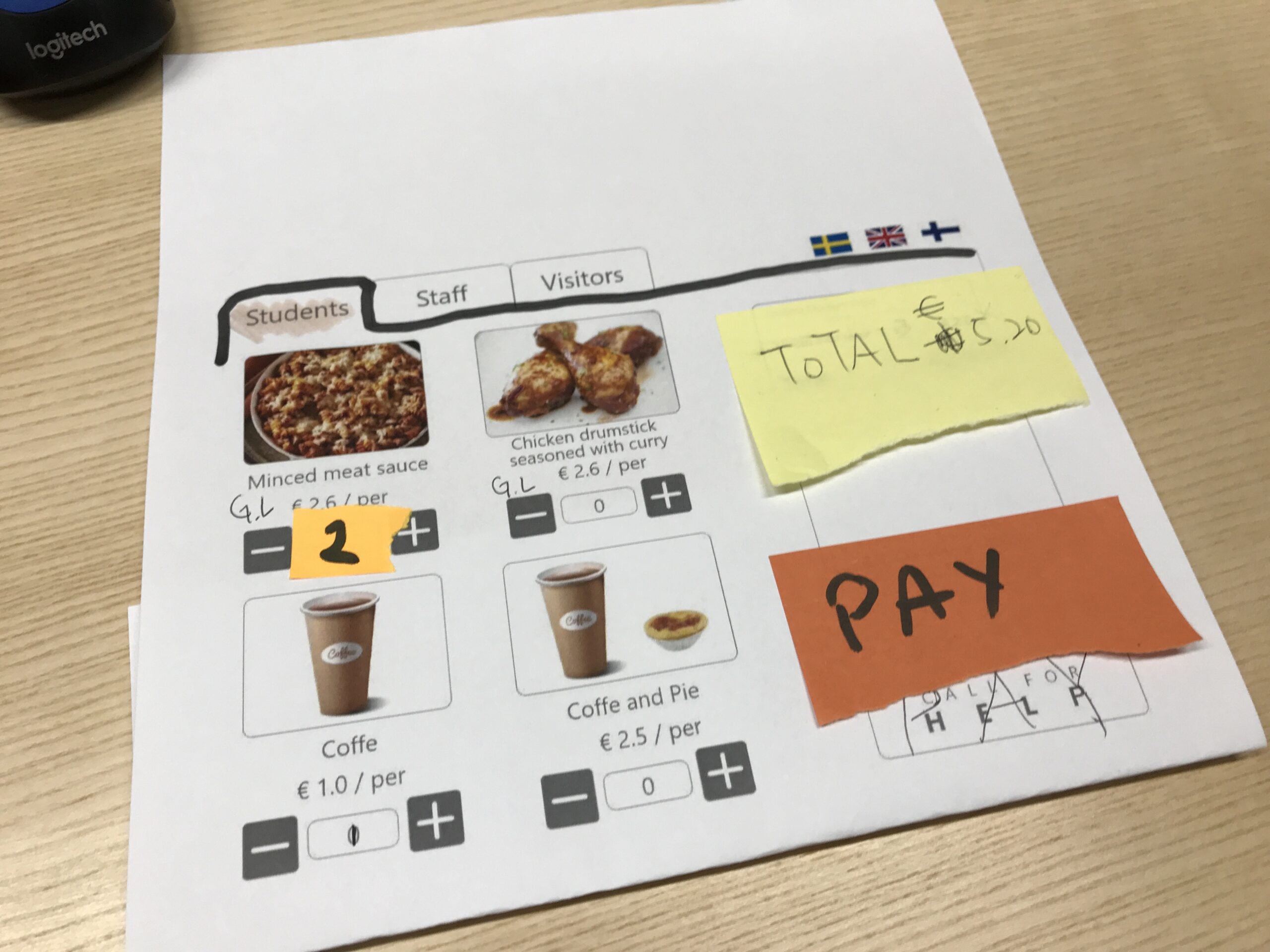
Final Design
After several iterations we adjusted the designs based on the feedback and started to work on the visual design and final version. As the restaurant is run by Fazer we added their colours and logo to give the interface a better branding
We created the prototype with Adobe XD. The interactive prototype can be seen here.
Future suggestions
One of the greatest pain points we could not solve in our designs is the authentication of the student status. From the current technical point of view, either the staff still has to confirm manually the status for students or usage of the app is required to receive the discount. However, for a better customer experience, we also suggest having other possibilities to verify the student status, for example, by:
- Enabling Frank app barcode or QR-code
- Using the HSL card and read the status with NFC
- Using an RFID sticker to identify the student status when a physical student card is used
Furthermore, we also suggest an improvement of the environment, as it is not clear enough for the user how to choose the checkout line and which lines only use card/MobilePay payment, by adding:
- Vinyl stickers on the floor to explain how to line up and pay
- Better information about the cashless system and the requirement to have MobilePay/Frank app to identify the student status

Conclusions
The research helped us to understand the user needs, as well as, understanding the system. However, in our research, we could have improved the personas by defining their goals better or doing some benchmarking, or academic research of self-checkout systems.
With our iterative design process, we could solve most of the pain points and test the usability of our design. It would have been great to be able to test this design in a real environment.